Designs v2
Based on feedback, the visual design has taken a cleaner, more professional-looking direction. Less DIY. Expressive elements like illustration and collage can now be confined to images, rather than being directly integrated into the website itself. Components have been added to facilitate this.
Note: The “latest activity” / NPM section has been removed for the time being – work on this is still in-progress.
Site header #
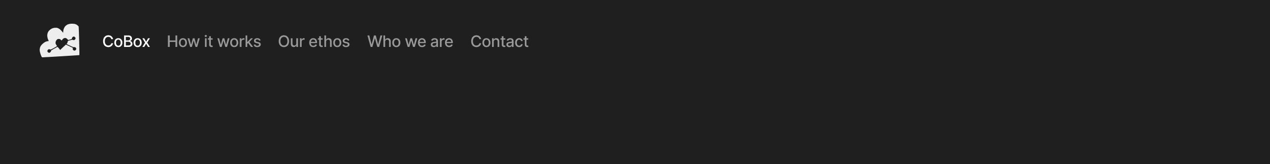
The new site header takes a simpler approach, with a reduced version of the logo for subtle branding:
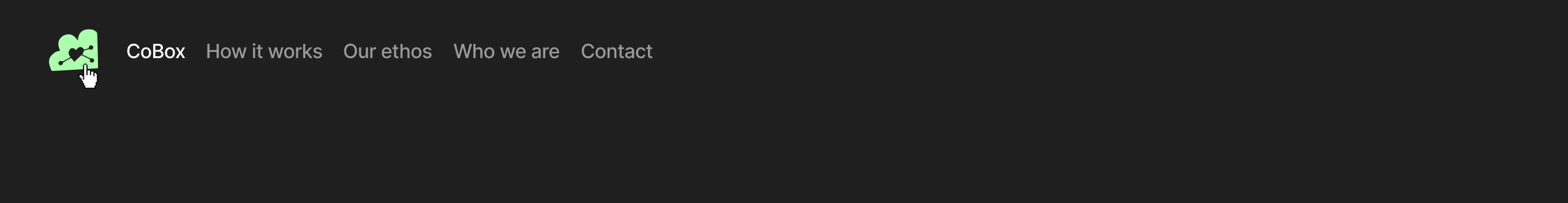
The colour logo is revealed on hover:
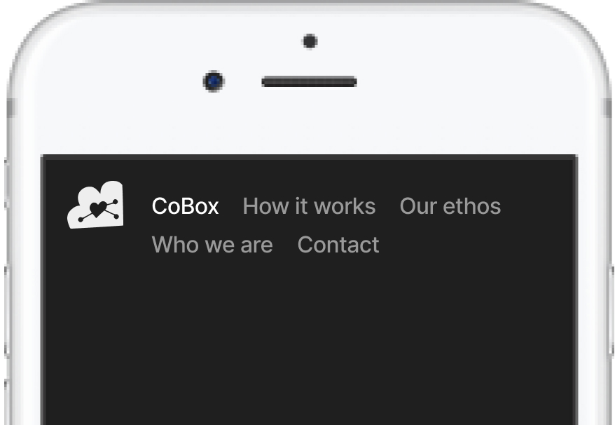
It still wraps the same on mobile:
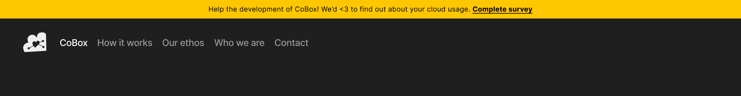
Announcement bar, as before:
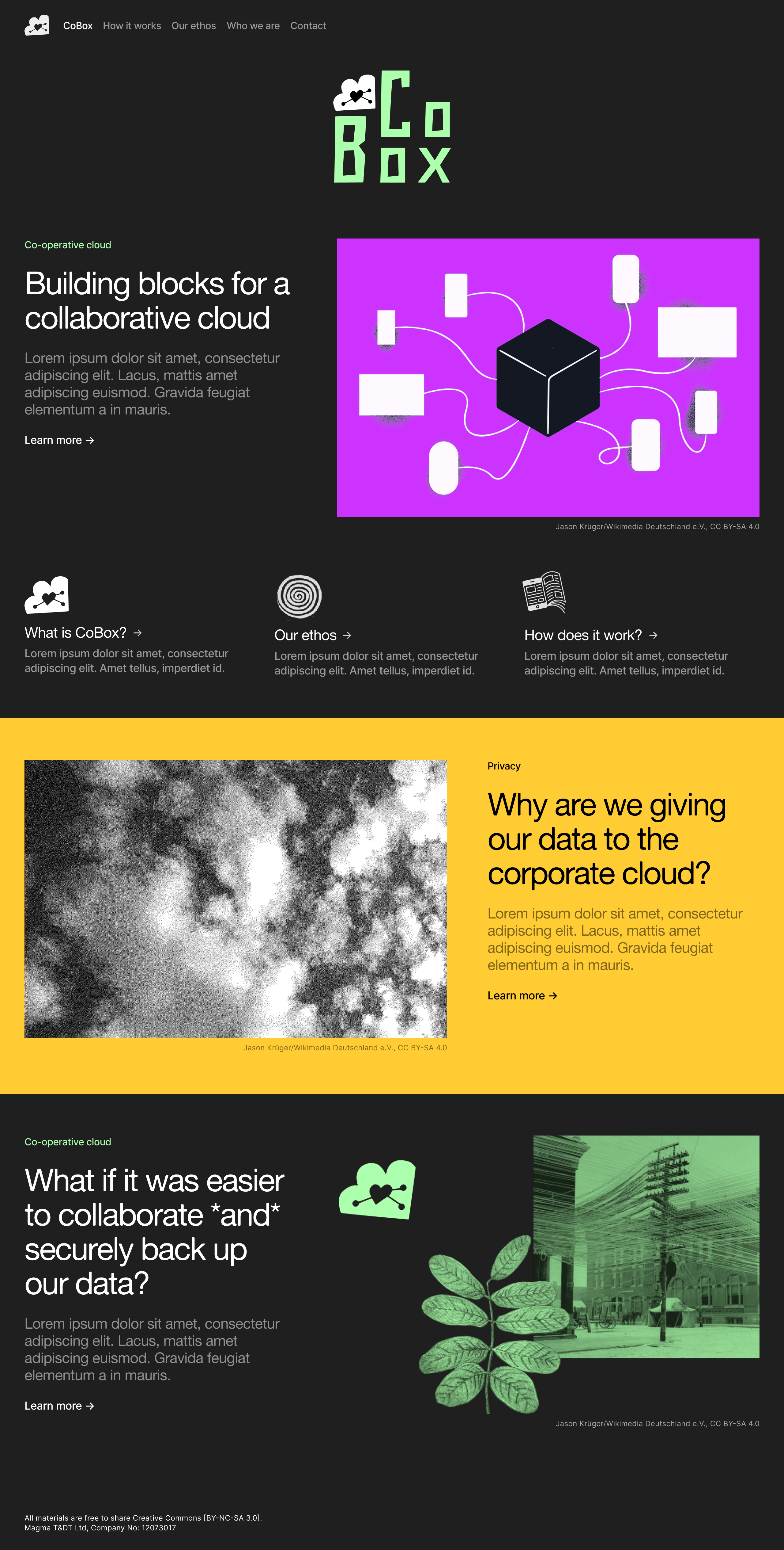
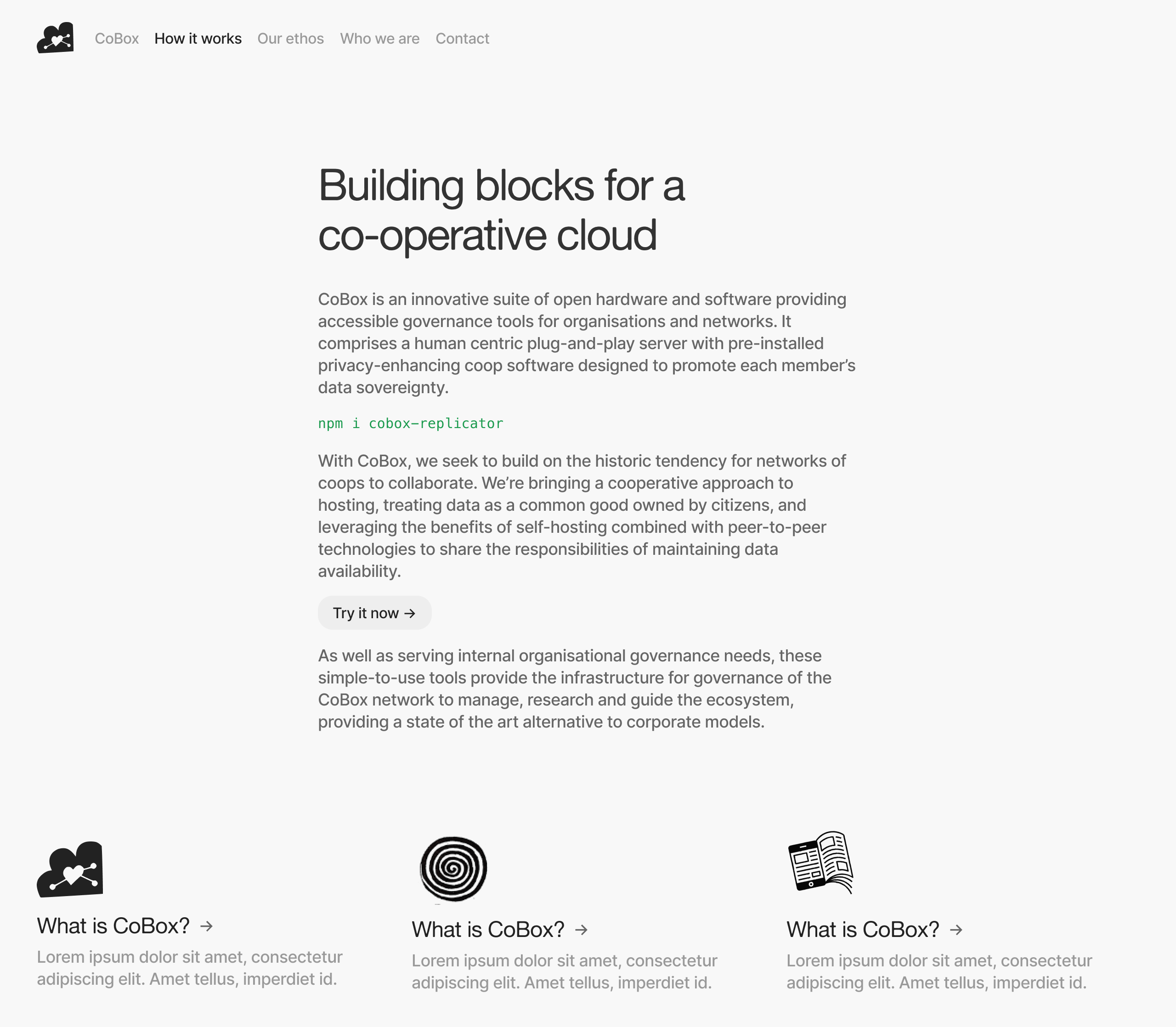
Homepage #
The full logo is visible on the homepage at the top of the page:
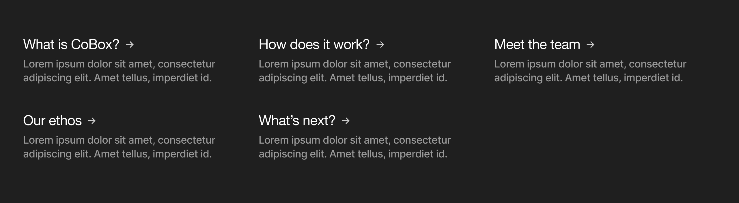
Link blocks #
These link blocks replace the colourful blocks from the previous design. A short description is added to provide more context:
And maybe a space for an image, like an icon or gesture:
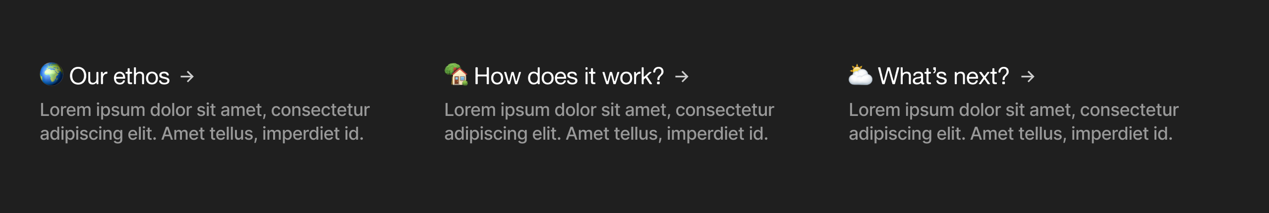
Or keep it simple, with emojis:
Feature blocks #
The feature block is a reusable component which brings together a short, impactful piece of text and an image. Colour could be selected in the CMS. Careful consideration of image and colour will make this component have a big impact on a landing page. This would be a good place to explore further illustration styles or stylized images (such as dithered images or the collages from the previous designs).
Example pages #
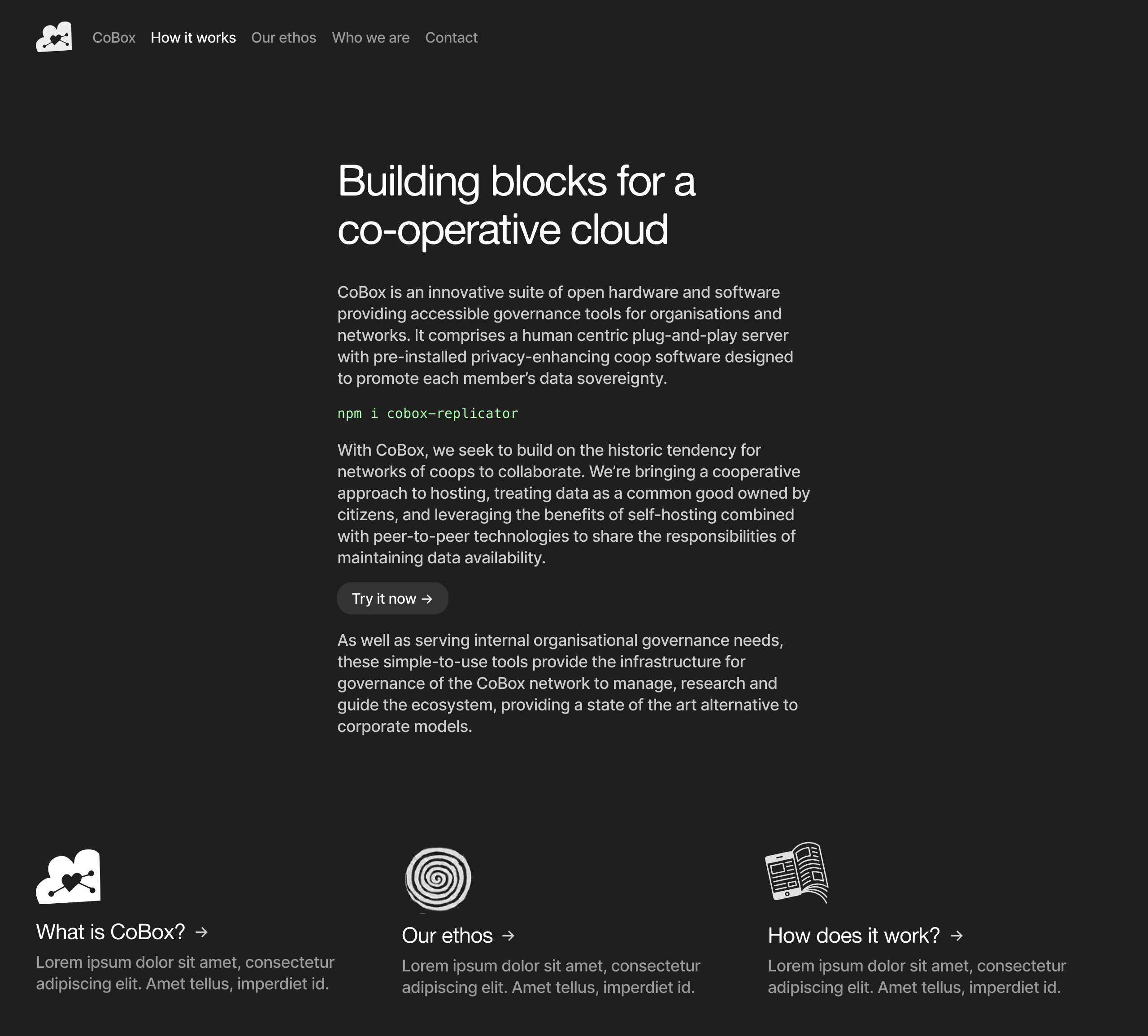
Typography #
A secondary typeface, Inter, has been added to improve the typography throughout. The primary typeface, Alte Haas Grotesk (AHG) is a display typeface; it is designed to work best at large sizes. Introducing a secondary typeface significantly improves the typography throughout, featuring better rendering at smaller sizes, more weights, true italics (AHG does not have any italics), alternative number styles (tabular numbers, slashed zeros), and even a few icons (such as arrows).
Light mode #
… it would be good to make that more uniform and classy somehow. I think probably the dark theme is a tough one as it easily makes everything quite heavy
I thought this point about the dark theme in your feedback was interesting. It is now very straightforward to implement alternative colour schemes in CSS. This might help cater to the different target audiences (if we broadly assume that technical audience will use dark mode and a less technical audience will use light mode). It's an interesting possibility.
Thank you very much, I welcome any questions and feedback.
– Sam