First designs
This page presents exploration for the visual design of the CoBox website. But first, let's recap on the criteria established in the style guide:
- Friendly
- Simple
- Analogue, "flat" 2d feel
- not too much animation
- Feeling of a physical device rather than digital "otherworld"
- "Backgrounded" design with only very specific elements of explicit style that should be contained in boxes.
- [Colour palette] Bright, cheerful colours
- [Spacing] A lot of space - for legibility and accessibility
In addition to this, we want to establish a simple set of suitable, well-tested components which we can use throughout the site templates, minimising the need for complex, hard-to-maintain code. We want to do more with less, and work to the web platform’s strengths.
We also want to design for the long term – the website is structured as a system of components and pages that can be used across a variety of content types. Content has been broken up into shorter pages which will be beneficial to mobile users, but also means we're not designing a single page site which may need to change in a few months time.
We're also keen to avoid a well-polished, slick aesthetic that is often associated with “tech” product design and software, and favour something a bit more imperfect and open-ended. We think the design should give space to the content itself, to not overbear the existing elements (such as the logo or illustration style), but rather offer a framework and set of visual devices to complement these.
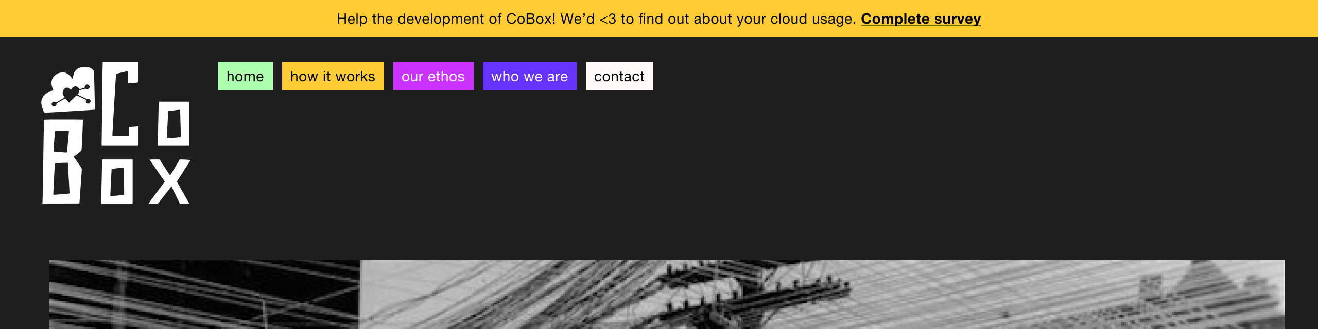
Website header #
Drawing inspiration from the angular and blocky logo, the site header makes use of little navigation blocks, creating a lock up with the logo and the navigation items:
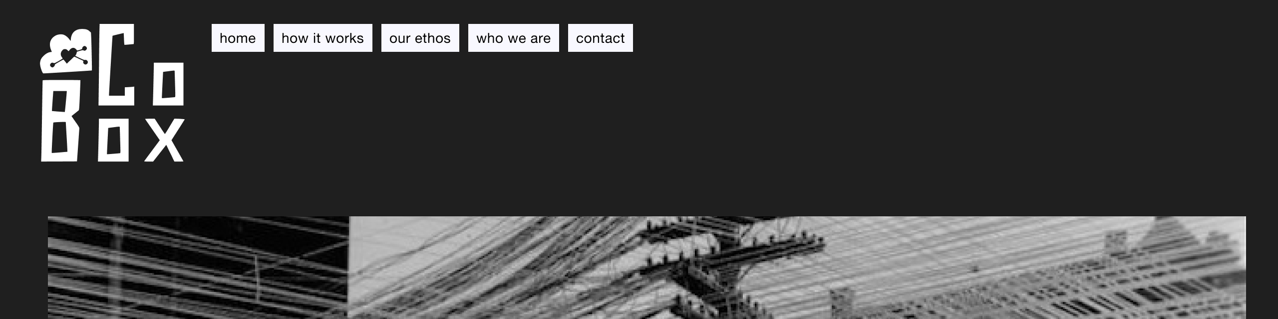
Colour is applied, drawing from the colour palette in the styleguide. This creates a lighter, friendler feeling, while being reminiscent of colour blocks in code syntax highlighting and other technical scenarios. Text can be white or black, whichever achieves sufficient contrast for accessibility requirements:
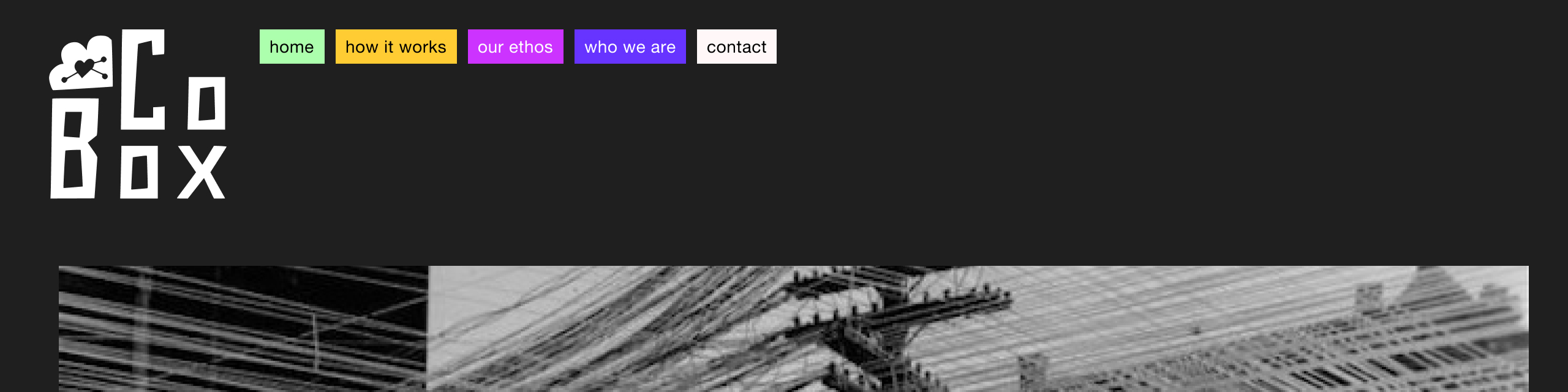
This simple navigation system can house a large number of menu items without losing visual integrity – items simply reflow into the available space:
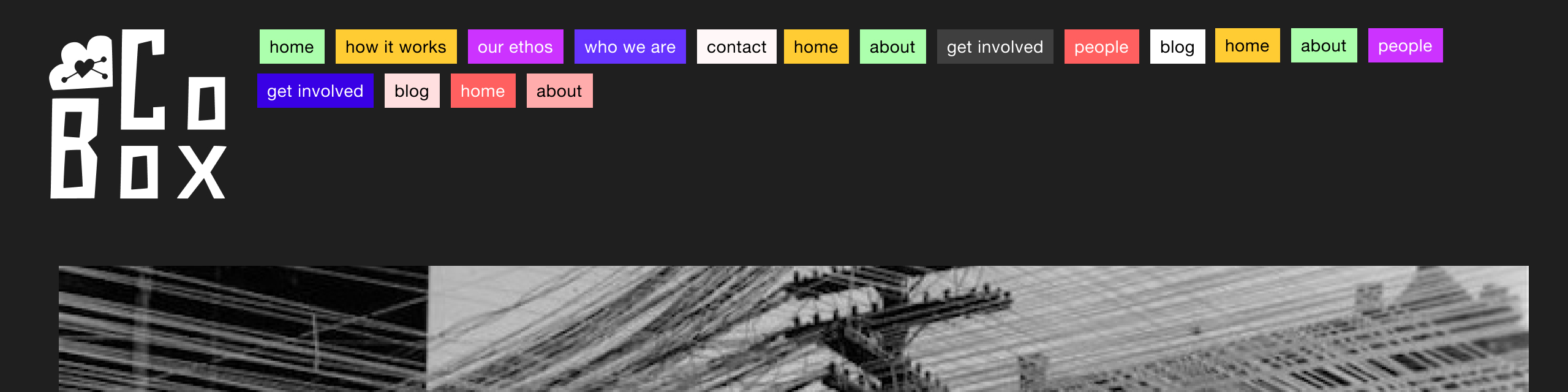
And on smaller devices the items can hug the shape of the logo a little closer, wrapping on to a new line when needed, This removes the need for complex JavaScript-based navigation, giving us excellent accessibility at no cost:

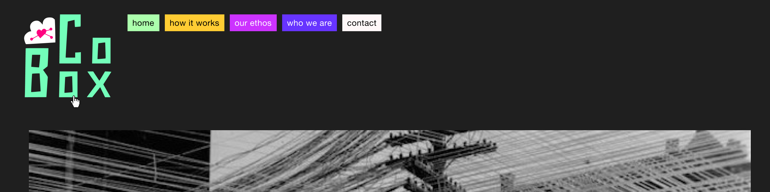
The full-colour version of the logo is revealed on hover:
A banner can also be included, which might be useful for temporary announcements:
Homepage #
The homepage is designed to be easy to use but also memorable and impactful, clearly and confidently communicating the project’s goals. Recent npm releases can be pulled in to a list to illustrate the project’s activity.
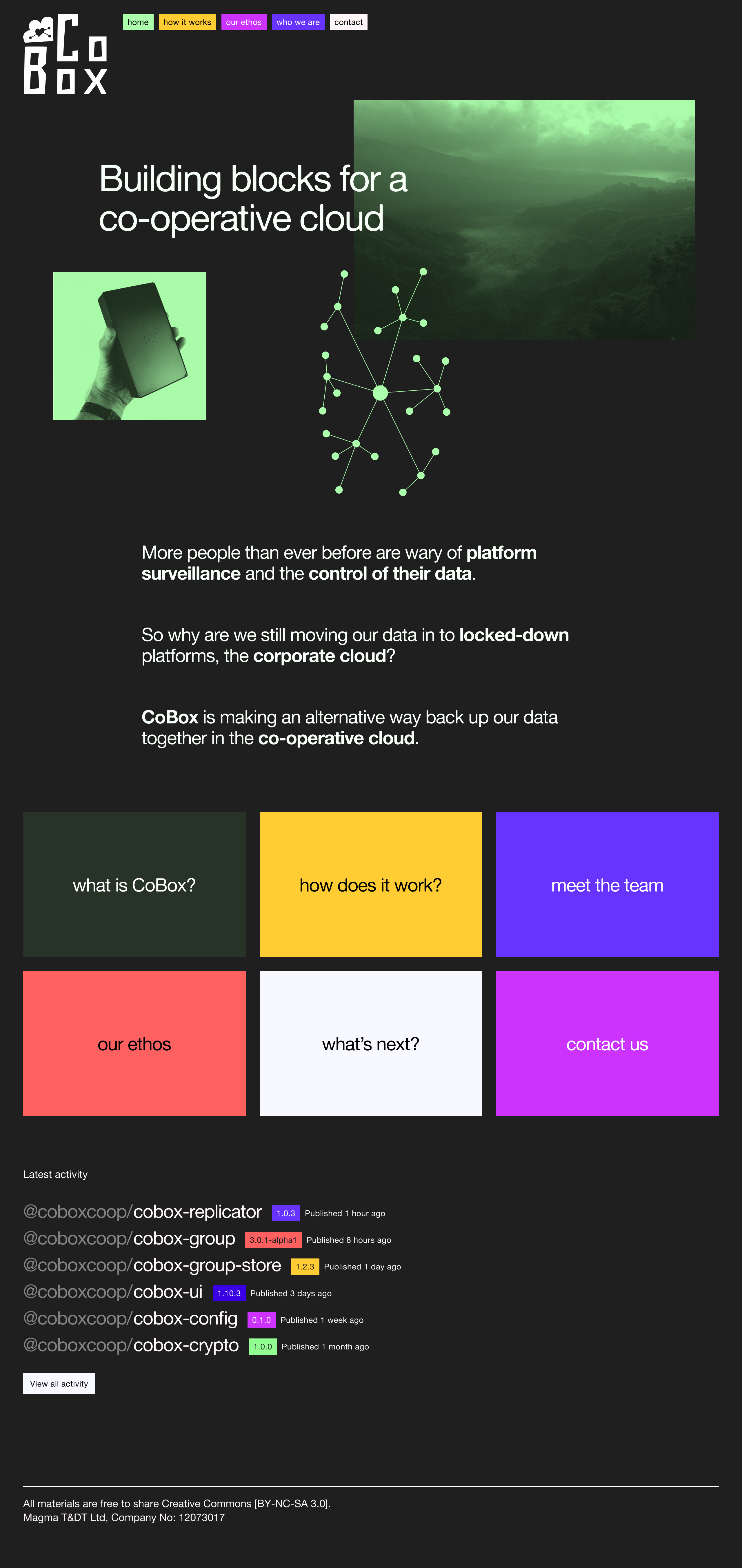
The above-the-fold collages combine the project strapline with thematic imagery (diagrams, photography, icons, etc. relating to the p2p / co-operative space). The images are treated in a single colour – both to bring uniformity to the different image styles, but also for the more lo-fi, print-like aesthetic. The collage elements shown here are purely for demonstration (largely drawn from Wikimedia Commons) – I'd suggest we work together on establishing a set of criteria for the types of images and on gathering a set of images for this.
While the actual homepage is proposed to be static, here is a looping video showing some collage arrangements, demonstrating how the system might work:
Pages #
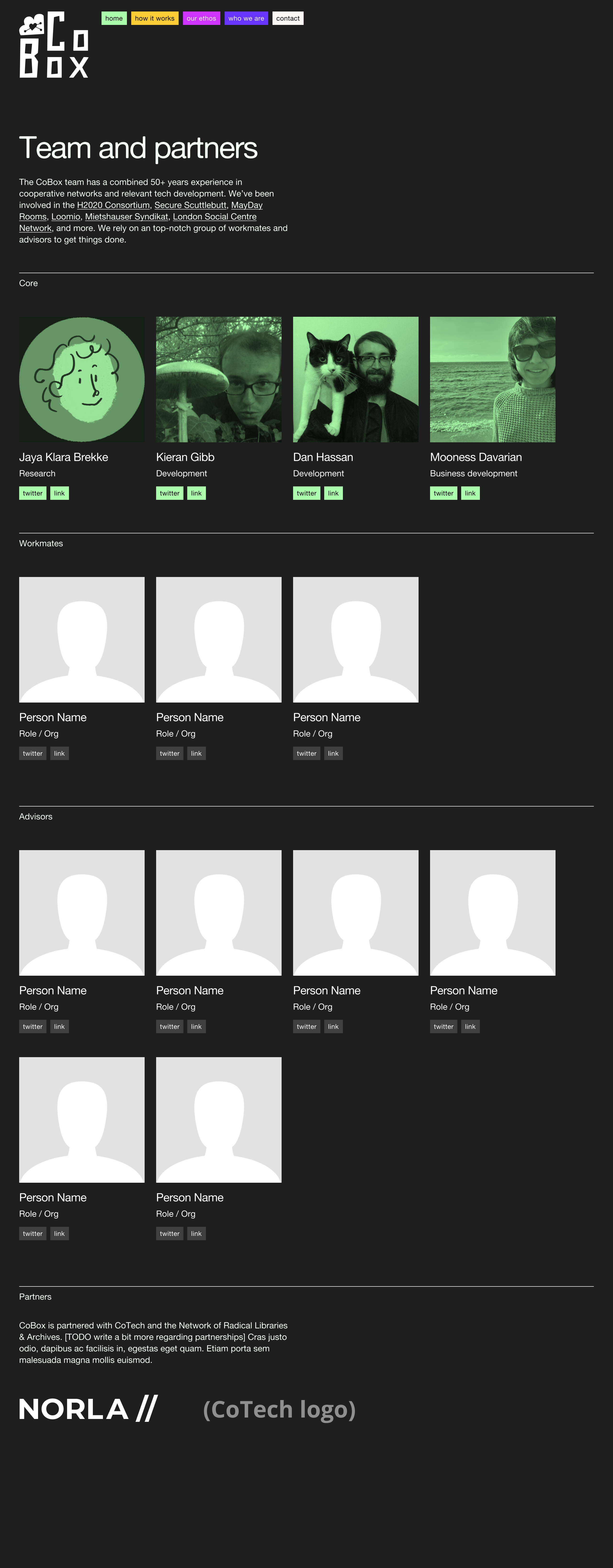
The ‘team and partners’ page features a custom layout. To bring uniformity to the different styles of images we can treat the images in a colour. Here, the core team uses CoBox green, and other images would be greyscale, but we could establish a different set of colours for each category (“core” = red, “workmates” = blue, etc.):
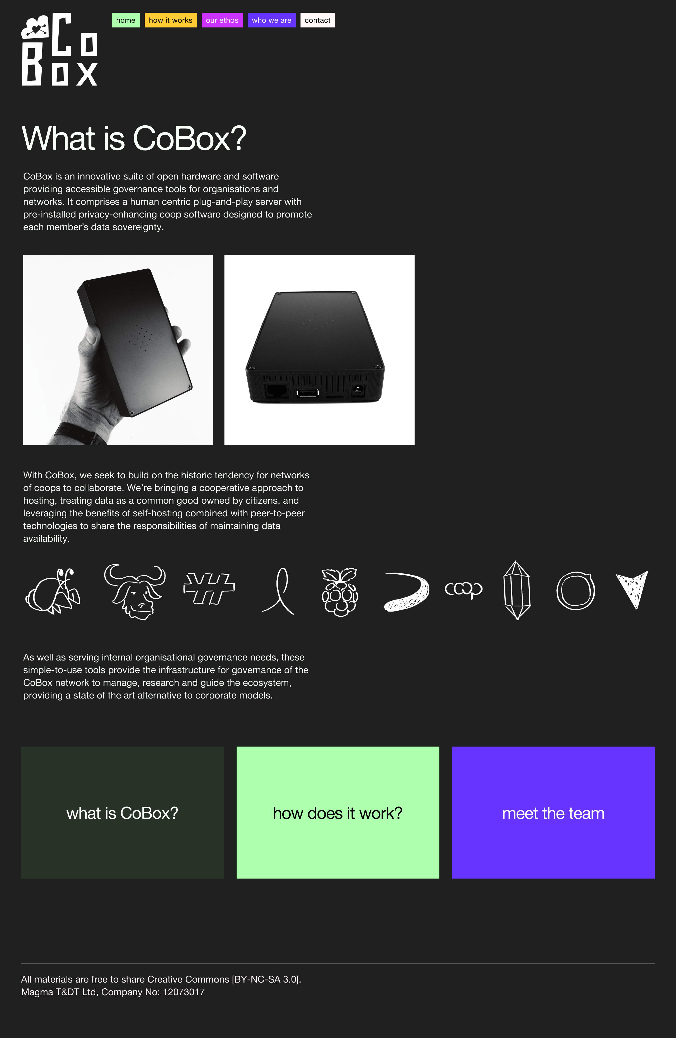
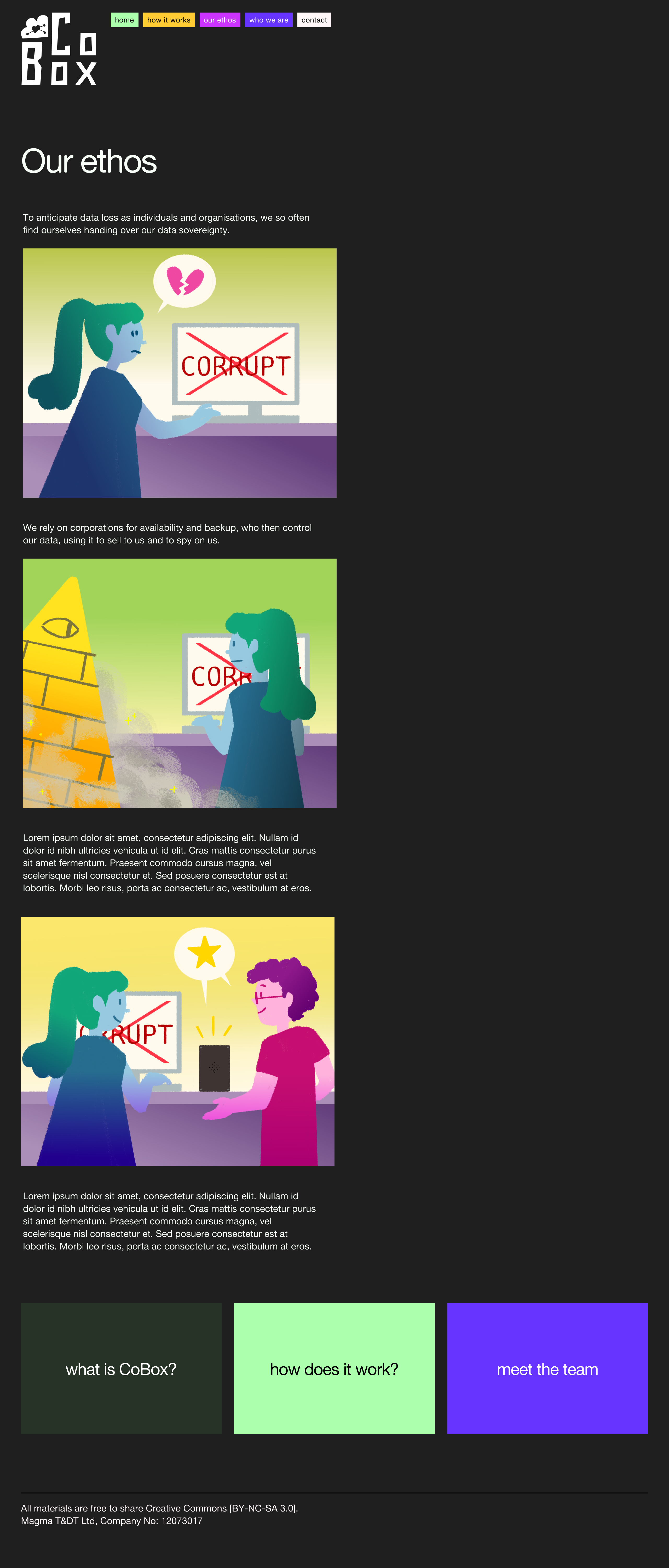
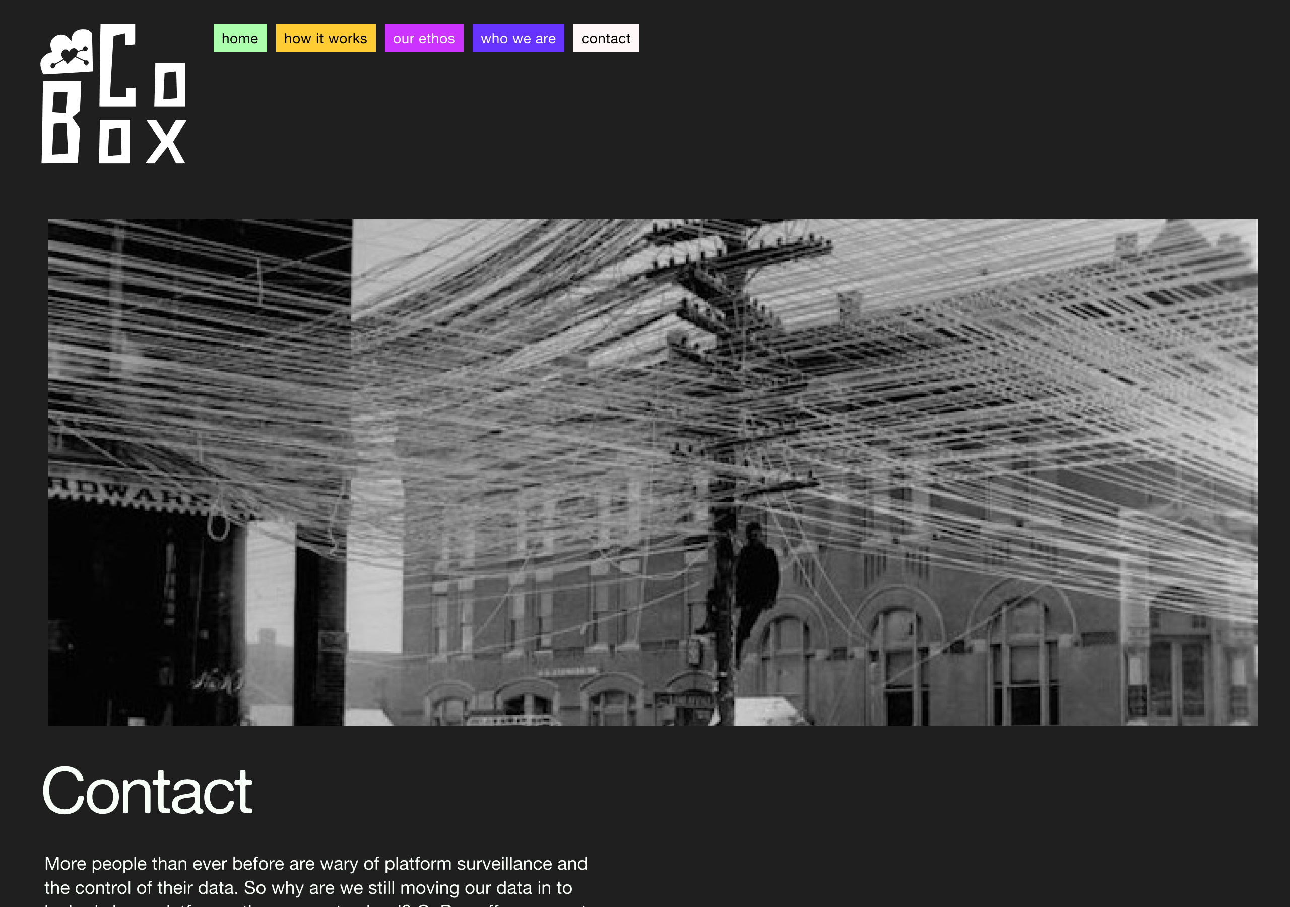
Other pages on the site share a flexible page template which can include images and text, optional link blocks, and an optional header image. The images below demonstrate some permutations of this, but it should be noted that the template is designed to be resilient enough to the new and unknown pages that the site might need in the future:
Thank you very much, I welcome any questions and feedback.
– Sam